Get in touch with us
Leave your details and we will contact you
Danskdesignlagersalg.dk
Country
Denmark, Finland, Austria, Europe
Duration
3 months
Service
HTML, CSS, JavaScript, Shopify Liquid
Industry
Sale of household goods
Challenge
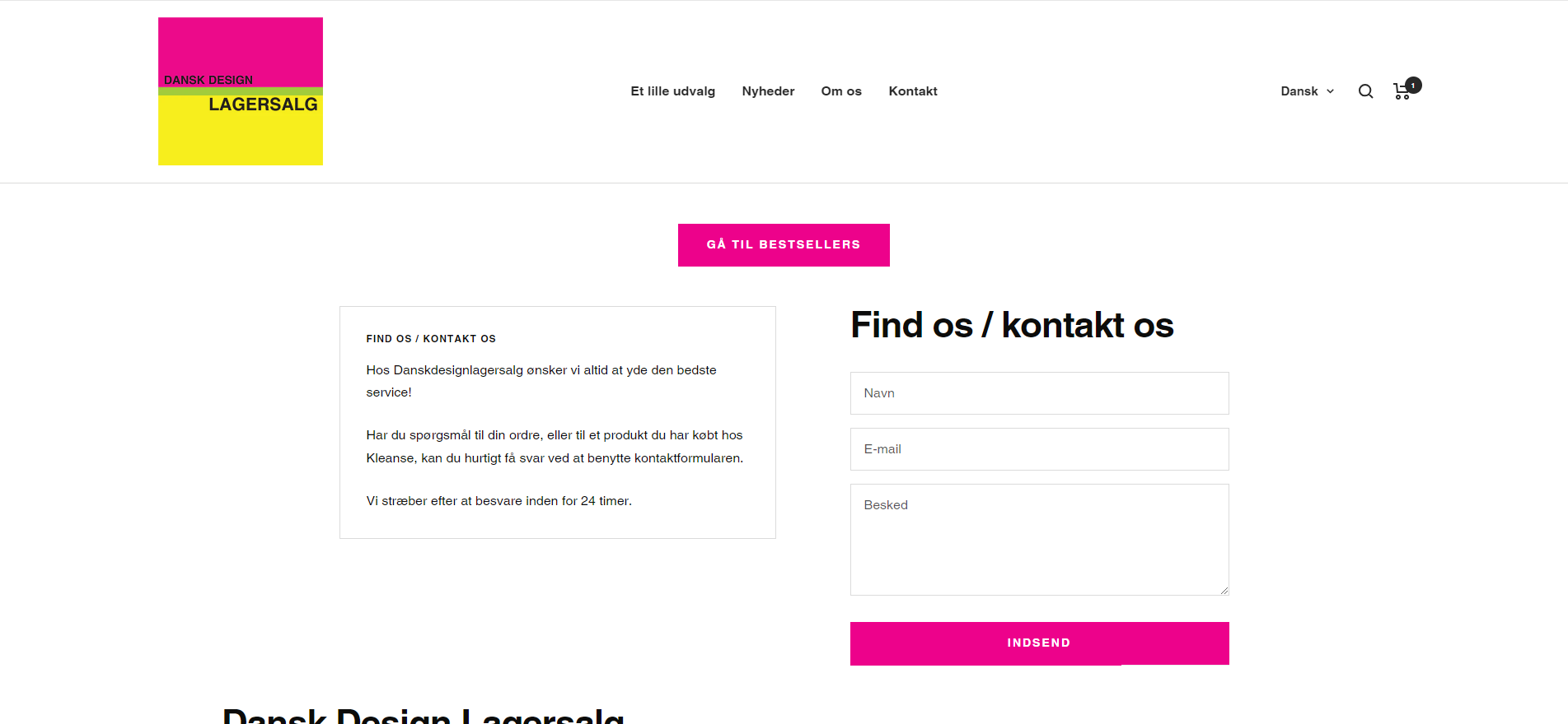
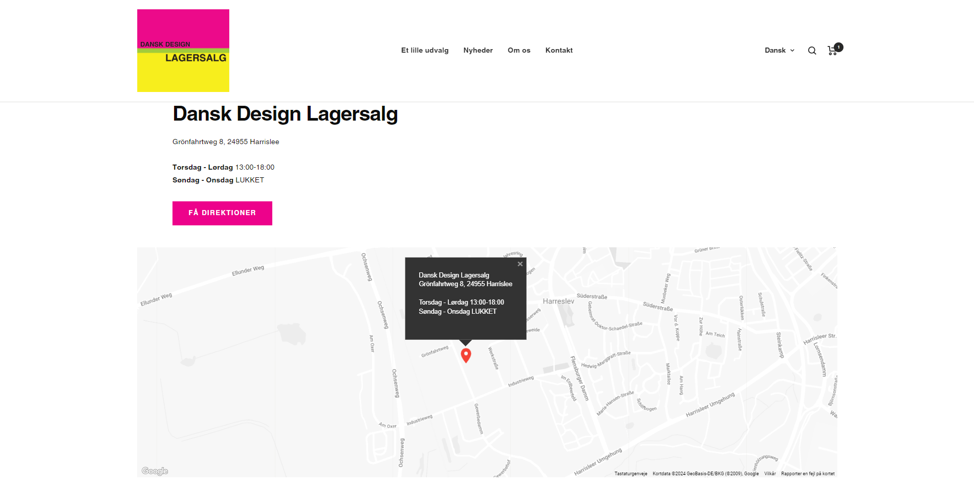
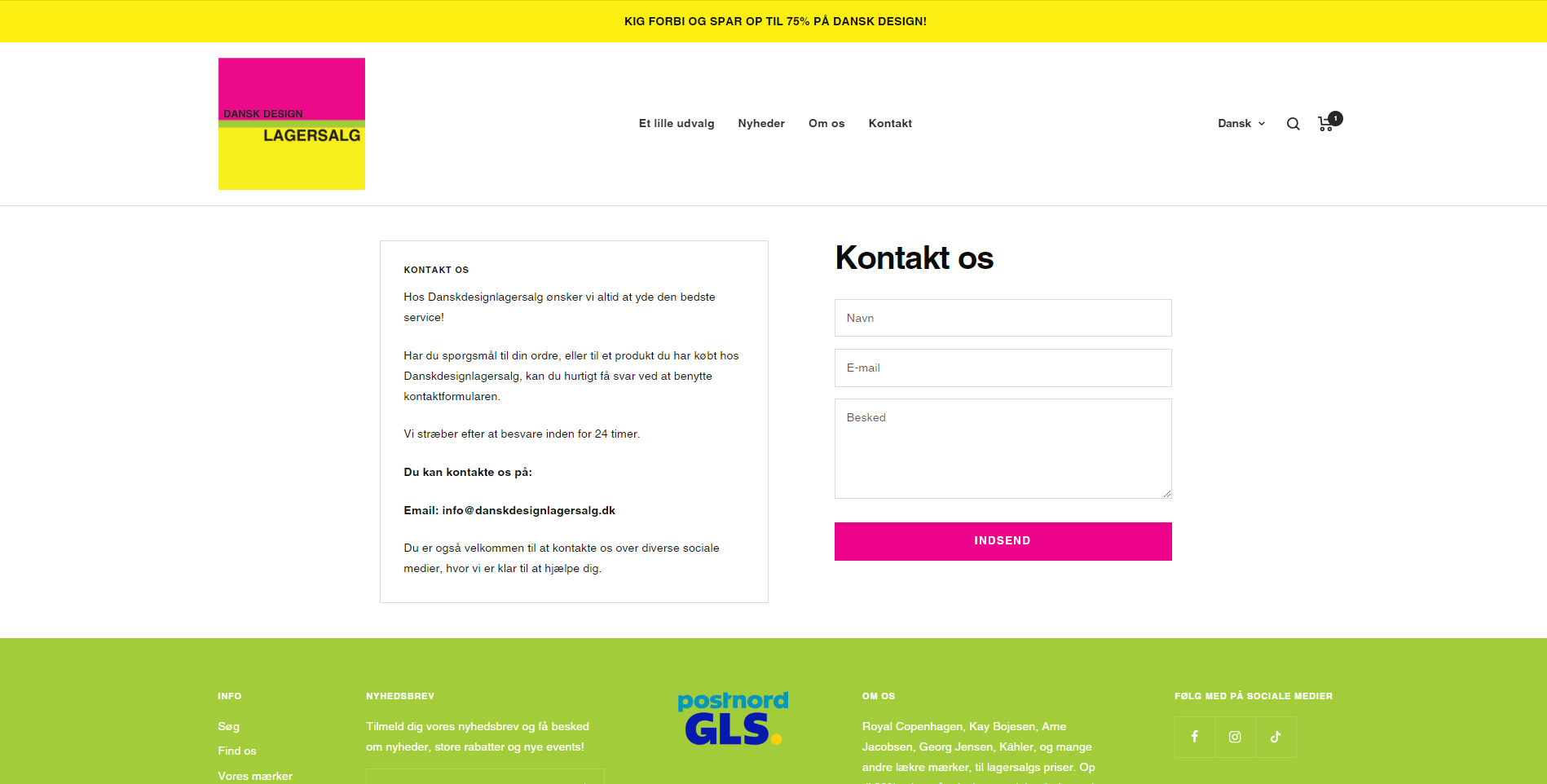
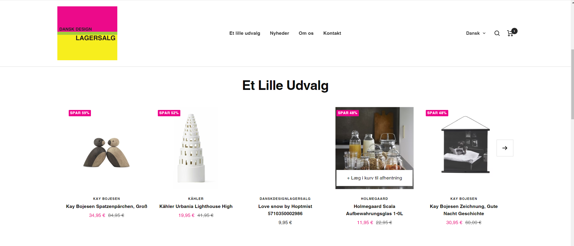
Here's the scoop: Our client was in a pickle, wanting to jazz up their digital storefront's look and feel. The goal? To make their site more eye-catching and smooth out any rough edges, making it a dream for users to navigate.
animation of elements
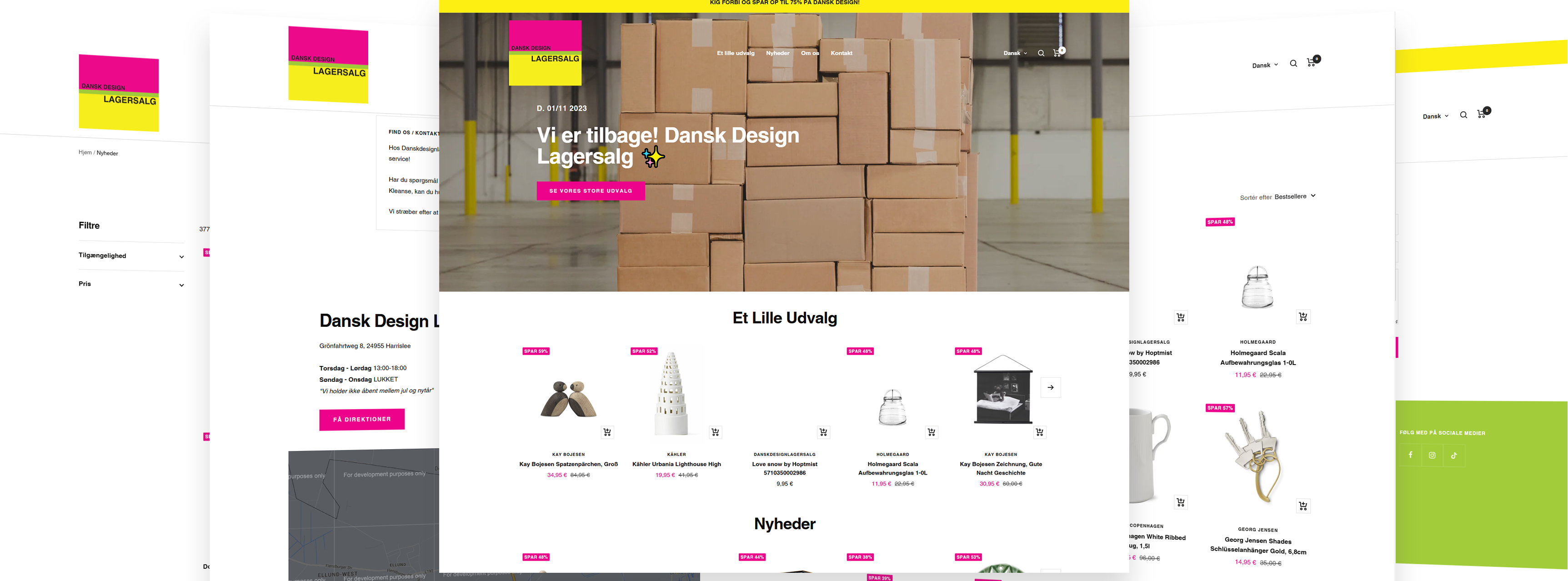
DEVELOPING PROCESS
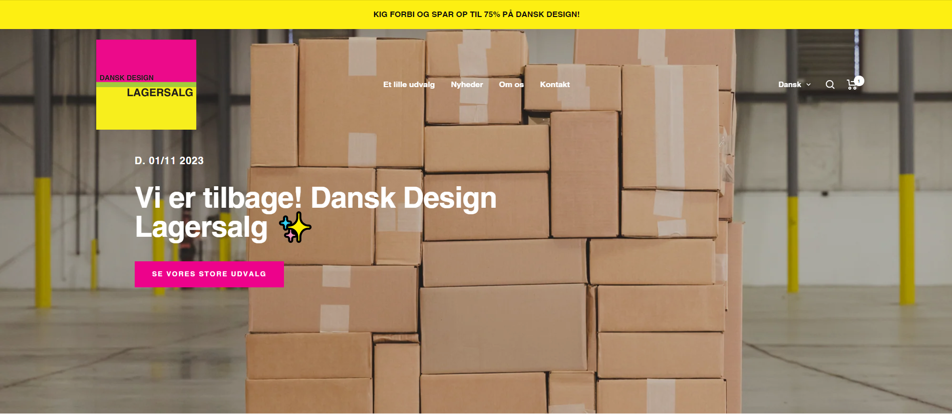
First things first, we rolled up our sleeves and took a good, hard look at where things stood. The client tossed us a website template they'd used before, but oh boy, did it have its share of quirks and quibbles, from oddball visuals to pesky data hiccups. We laid out a game plan, dividing and conquering the task into bite-sized chunks. Wrestling with the site's jumbled code was like decoding a mystery. But, with a variety of code editors in our arsenal and a knack for reformatting, we got the machine humming nicely.
Time it took: We're talking a three-month saga here, from the word "go" on analysis and strategizing, through to unveiling the visual touch-ups and crossing the finish line with functionality tests.
Tech wizardry involved
Revitalizing the client's web space, a haven for home decor aficionados, meant bringing out the big guns technology-wise. Each piece of tech played its part in the grand scheme:
- HTML. The bread and butter for arranging the site's content, ensuring everything from text to images was laid out in a clear, accessible way.
- CSS. This magic wand let us style up the website, making it not just pretty but adaptable to any screen size and spicing up user interactions with some slick animations and transitions.
- JavaScript. The secret sauce for injecting interactive elements that keep users engaged, from nifty forms to slide shows, not to mention speeding up load times for that SEO boost.
- Shopify Liquid. Tailor-made for Shopify sites, this tool allowed us to customize page layouts and dynamically update content, keeping the site's design flexible to pivot with the business's evolving needs.
This combo didn't just amp up the site's look; it dialed up its functionality, making it a cinch to navigate on any device and massively improving the user experience. End result? A site that not only looks the part but feels intuitive, encouraging visitors to stick around and convert.
RESULT
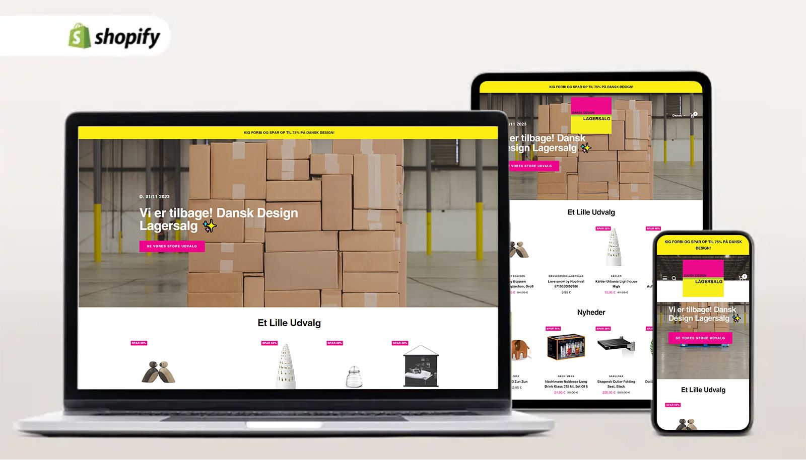
Kudos to the team's know-how and collaborative spirit, we crossed the finish line with flying colors. All targets were hit bang on schedule, breathing new life into the site with an interface that's both spruced up and a breeze to use.
What they say about us
Let's talk!
Amet minim mollit non deserunt ullamco est sit aliqua dolor do amet sint.
Tell us about your project

